We've used all the same creepy Halloween decor we made the last two years.
But this time around it's all on the mantle, and the nature art that usually hangs there just wasn't working, so RJ and I planned a new Halloween art piece for the mantle.
But this time around it's all on the mantle, and the nature art that usually hangs there just wasn't working, so RJ and I planned a new Halloween art piece for the mantle.
The wall hanging is a base of old fence I snagged from a neighbor.
On top we painted with craft paint, stain, and more paint.
It was really quick and thrown together, leaving some raw wood and uneven edges.
On top we painted with craft paint, stain, and more paint.
It was really quick and thrown together, leaving some raw wood and uneven edges.
Here's how it looks with all the other creepy mantle projects.
A few of my favorite details include the small but creepy dead man hanging on the smallest, most distant tree.
I debated about putting it in as it's pretty morbid, but I doubt too many people will notice...and it's Halloween and there's not really any other time to be creepy.
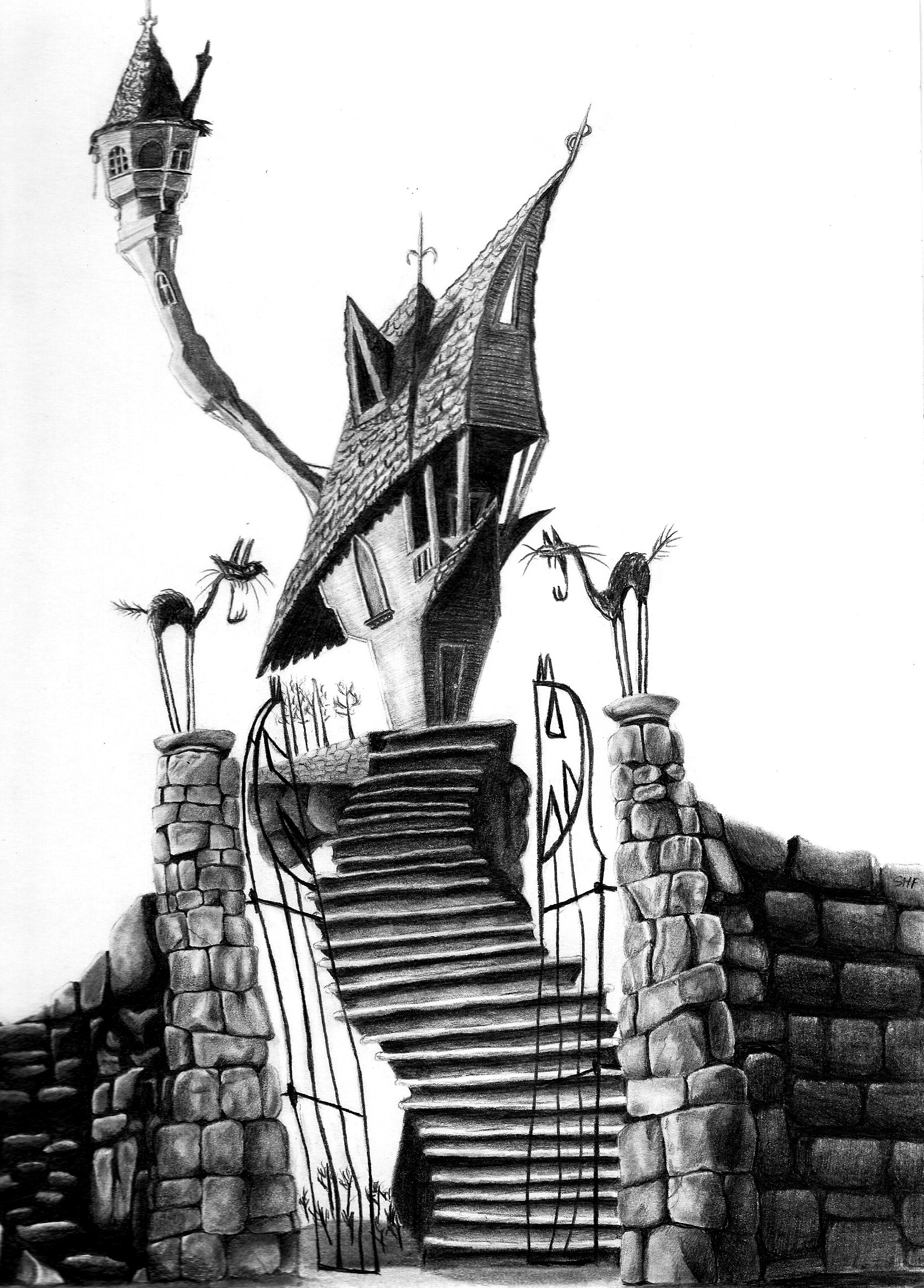
The haunted house in the distance is actually a mimic of Jack Skellington's house from Nightmare Before Christmas.
previous Jack projects:
So to make your own cheap, easy Halloween landscape:
I used scraps and a nail gun to attach the boards together, not even making them even on the ends or cleaning them up.
Because the paint job is meant to be sloppy to distress later, RJ did the green and I painted the orange. I'd recommend using dry brushes and minimal water for this part if you're planning to sand paint away to reveal wood grain.
We used a mixture of craft paint.
We used a mixture of craft paint.
I used a hand sander and 60 grit sandpaper to quickly remove the paint in areas, revealing the fence and wood grain.
To mute the bright orange and toxic green, I applied wood stain on top.
For the bottom "pasture" part that would be in shadow, I used black Winmax ebony wood stain.
Then to muddle the orange sky, I used Minwax Red Mahogany, but really lightly. I didn't paint it directly on, but dipped a rag and used very little over the orange.
The above shot was my first run on adding the elements. I originally wanted to keep it really simple, just the tree and distant creepy house. But the way the boards were painted made it look crappy to me, like half top orange, bottom green, and it looked like I just plopped vinyl stickers on.
So after it sat for a week on our kitchen table, I decided to finally come back and try to add dimension to make it look like what I planned, a sunset and landscape.
I thought about having a creepy stagecoach driving to the house, but kept it easy with more creepy trees and a few head stones. I think the road is what really gave it the depth to look more like a scene.
Happy Halloween!
We have a few more Halloween projects in the works.


It looks amazing! It has a really creepy look to it that I just love. By far your mantel is the best that I have seen so far.
ReplyDeleteLOVE IT....What a great idea!! I'm pinning it so I can come back and give it a try, when I have time!!
ReplyDeleteHmmm...A snow scene would be great for winter too.
Thanks for the insperation,
Denise
Love seeing your creative process!
ReplyDeleteThis is fantastic! It turned out great. You know what's kinda funny? I'm already picturing a pretty landscape using the same technique. More pinks in the sunset, maybe an idealic farmhouse with animals in the yard...or something. Hahah! It really is cool!
ReplyDeleteawesome. I can't wait to see the kids in their costumes.
ReplyDeleteoh this is so cool! you're multi-talented. :)
ReplyDeletewow that is really amazing! i LOVe how it looks. thanks for the ideas!
ReplyDeleteThis looks great! I'm so impressed! And I love that your kids helped.
ReplyDeleteI really love the wood art! thanks you for sharing :)
ReplyDeleteThis is so cool. Impressive Jessica!
ReplyDelete