
Tree Landscape Painting {Ballard Designs Knock-Off}
1:04 AM

Acrylic on MDF
24" x 48" in 3 panels
I have never really liked having this mirror above my mantle. It's tall enough, when anyone looks in the mirror, you just see the ceiling fan. So I've been thinking of something else up there for a while.

When I saw these prints in Ballard Design's catalog, I loved them, the colors are perfectly what I chose for my living room. But I didn't have $600 to pay for prints. I also loved the distressed look they had.

So I set out to try to make my own paintings. Once I got looking at larger canvases, I almost gave up, as they are quite expensive on their own. But then I got an idea to use 1/4" MDF and make my own "canvas". So one 2'x4' sheet of the thinnest MDF from Home Depot was $6.00. I had them cut it into 3 pieces, 16" wide each.
Then I took 1x2 pine firring strips and cut out backing to make them thicker, to look like gallery wrapped canvas. It took 3 1x2's which are $1.00 each. I just used clamps and glue for the wood on the backs, since I didn't want nails or holes on the front.

After I built my canvases, it took me over a month to get to the actual painting. I did have a baby in the midst of it, but of all the different areas I like to try to create, painting is the most intimidating to me. Building a piece of furniture is more comfortable to me than trying to create real art.
But this ended up being easier than I thought, and you just kind of slop paint on and around. I had tons of moments where I thought "well this is going in the burn pile, at least it only cost me 9 bucks." But then I'd try something else, and it turned out OK. I guess it's a simple almost abstract scene, so you don't have to be as much an artist in my opinion as much as experimenting with layering. So anyone can do it, I don't know real painting techniques, this was just globbing paint around really.
So once the thin MDF rectangles had the pine borders on the back, I "primed" them with black latex paint I had. It was semi-gloss black paint. I just did one coat and applied it with an older crappy brush.

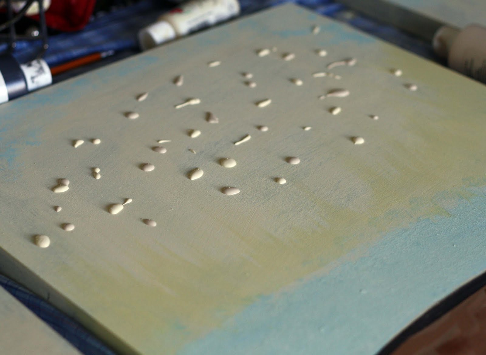
For my paintings, I first painted the top halves ivory, and the bottom a medium brown. I just use cheap craft acrylic paint. I let the little guy help in the beginning.

I just plopped different colors of paint and stippled them on to add thick texture for the dark bottom.

For the next lighter brown layer, I started with just different browns and short thick brush strokes. To darken it up, I dry brushed black over the whole bottom section. You dip the brush in the paint then on a paper towel wipe most of it off and just kind of lightly brush the dry paint to skiff the surface. I did this with the blue streak too.

To make the sky blotchy, I plopped small globs of ivory and tan paint all over, then used the crappy brush to paint straight down and blotch it around to kind of lend the two colors and have texture in the paint. Kind of a sponge effect.

Then I added the black/ brown trunks. the green tree tops were also just sloppily patting on paint. I started with a middle shade, then went back through and added the darker greens, then finished with the almost yellow highlights.

To add more texture, I did some stipple/ sponge in blue on the top.
Then to try to age the paintings, I sanded in areas, mainly on the borders. I used 200 grit sand paper and got down to my black base. All the crappy paint brush strokes added cool texture as I sanded, you can see the vertical stripes of texture showing through.

To finish it off, I had some varnish that I used as a glaze by adding some brown paint to it. I painted it on, and it was way to brown. So I started freaking out, grabbing paper towel and dipping it in water to try to get it off. It ended wiping off with big streaks, and I got interrupted with the baby crying, and came back and decided it would have to just be "age". So then I had to do too dark varnish and scrub parts off leaving streaks on the other two paintings to have them all match.
Then I just used a sponge brush to paint a clear coat of varnish over everything.
So now they sit above the mantle in one landscape painting. Definitely not as good as the professional art prints from Ballard Designs, but the whole painting only cost $9.00 because I already had all the paint. So for the price, this cheap girl was satisfied with my cheap knock off rather than the real thing. Plus it's kind of fun knowing you made it yourself. I just hope when people see it, it looks like actual art rather than sloppy amateur attempt, which is kind of what I see since I know who made it.


So now how to decorate the mantle. I plopped the blue vase, lantern, books, back on there, but if you have suggestions on how to decorate a mantle, I'd appreciate them. I'm thinking I may need to get rid of the vase as it kind of competes with the painting now?


11 comments
Amazing!!! You did a wonderful job! Love it!
ReplyDeleteThey look amazing! I love it!
ReplyDelete(I would still use a blue vase but about the same size as your black lantern. It would bring a nice symmetry & subtle "framing" to the painting.)
Ok. Making the canvases is awesome in and of itself. I love the triptych, and you've done a great job on the painting and getting the texture in there.
ReplyDeleteI think you did a good job. I like them. :)
ReplyDeleteWOW!
ReplyDeleteVery Cool! I'm glad you stepped out of your comfort zone and did this. You kind of inspired me to finally take up that project that I'm putting off for about an year now. the paintings look cool.
ReplyDeleteYou did a great job! bravo!!!
ReplyDeleteVisiting from Knock off Decor. LOVE this! I actually like yours better. I also like that yours is three rather than Ballard's two. Everything is better in odd numbers for some reason. Great work!
ReplyDeleteI'm visiting from Knock Off too...I really like your version. I've seen plenty of *expensive* art that looks likes a monkey or a three year old painted it. Yours is great and I'd be proud of it if I had painted it.
ReplyDeleteI think a green vase would look better than the blue...but that just might be my color preference rearing its ugly head.
Hey, this looks great! You are selling yourself short, go back and edit out all instances of 'crappy' 'cheap' and 'sloppy', they don't apply.
ReplyDeleteHello Jessica! I found your beautiful tree landscape art looking for links on my roundup post on triptychs and have it linked there! Your knock-off really turned out great!!
ReplyDeleteThank you for stopping by, we love to hear from you!